
Post by herrwozzeck on Nov 8, 2012 3:47:44 GMT 1
Well, there's one thing I wanted to address, but first, my thoughts on the election.
I think we'll be okay with this. Personally, my favorite moment of the whole election was when Todd "Legitimate Rape" Akin lost his Senate race. I swear, I have never felt more satisfied about karma getting a politician in my life.
But... Well, I actually wanted to address meironmaiden for once, so... yeah.
 Now... here's something that should prove enlightening. This is a county-by-county breakdown of the voting in the election. Red is Romney, Blue for Obama.
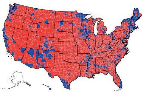
All that tells me is "the geography of the United States of America prefers Mitt Romney". I don't find it "enlightening", so much as "misleading".
For one thing, this chart very much ignores the possible population density of each district, and subsequently how many votes were cast in each district. When I double-checked this against a breakdown that gave the numbers of ballots counted in each county, the whole conceit of this graph being accurate fell apart almost immediately. All it tells me is the geography of the election: unless you have the amounts of the populations written down, then the geographical distribution of 'red counties vs. blue countis' is ultimately quite meaningless.
And for another thing... Are you sure you're posting the county map for the correct election year, meironmaiden? I ask because some of the districts in the map you showed us are actually incorrectly colored (Most of southern California actually turned up blue rather than red, there's a district in west Nevada that actually turned up blue (as opposed to the red that was shown on the chart), a couple of counties in Minnesota are incorrectly colored (such as the county nudged directly in the south-east corner of the state), and all but one county in Ohio that has a shoreline on lake Erie actually voted blue rather than the red displayed in the chart.) It's one thing to give us a chart without any listed statistics, but to give us a chart that is also inaccurate as well?
Yeah, I think you'll forgive me if I don't find that 'enlightening' in any way.
I think we'll be okay with this. Personally, my favorite moment of the whole election was when Todd "Legitimate Rape" Akin lost his Senate race. I swear, I have never felt more satisfied about karma getting a politician in my life.
But... Well, I actually wanted to address meironmaiden for once, so... yeah.

All that tells me is "the geography of the United States of America prefers Mitt Romney". I don't find it "enlightening", so much as "misleading".
For one thing, this chart very much ignores the possible population density of each district, and subsequently how many votes were cast in each district. When I double-checked this against a breakdown that gave the numbers of ballots counted in each county, the whole conceit of this graph being accurate fell apart almost immediately. All it tells me is the geography of the election: unless you have the amounts of the populations written down, then the geographical distribution of 'red counties vs. blue countis' is ultimately quite meaningless.
And for another thing... Are you sure you're posting the county map for the correct election year, meironmaiden? I ask because some of the districts in the map you showed us are actually incorrectly colored (Most of southern California actually turned up blue rather than red, there's a district in west Nevada that actually turned up blue (as opposed to the red that was shown on the chart), a couple of counties in Minnesota are incorrectly colored (such as the county nudged directly in the south-east corner of the state), and all but one county in Ohio that has a shoreline on lake Erie actually voted blue rather than the red displayed in the chart.) It's one thing to give us a chart without any listed statistics, but to give us a chart that is also inaccurate as well?
Yeah, I think you'll forgive me if I don't find that 'enlightening' in any way.