|
|
Post by Mr. Glow on Oct 24, 2009 8:28:56 GMT 1
I know this is nitpicky, But the HUD for Mass Effect 2 has been changed from the one seen in all the E3 combat demos. 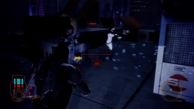 It's been changed to this little article, although I believe this is not final either, but with only three or four months to release, you'd think they'd have the HUD sorted. 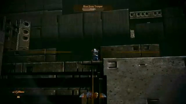 Now I'm not really in favour of this one, it looks too simple, the health bars for party members are too small and I can't see Shepard's health on it, also the Merc has "health" written on his health bar, which looks a bit stupid, I never wondered what the red bar was by my enemies name that got smaller as i shot them was in Mass Effect 1. So which HUD do you guys prefer? |
|
|
|
Post by wolverfrog49 on Oct 24, 2009 13:09:35 GMT 1
The first one, it looks nicer. Although I do wise Bioware would make the HUD easy to understand, I thought the first game's one was pretty confusing.
|
|
|
|
Post by Zarsthor on Oct 24, 2009 14:42:48 GMT 1
Old one. I understood the old one easily and I liked when people were near death and it did that heart monitor animation. I don't understand the new one it looks like a microwave panel.
|
|
|
|
Post by Mister Buch on Oct 25, 2009 0:25:58 GMT 1
I don't like how it has 'health' written on the health bar. I hope this is not the finished version, or not the Xbox version.
|
|
|
|
Post by Tillian Panthesis on Oct 25, 2009 12:18:44 GMT 1
We'll have to wait and see but so far I think the 2nd one is confusing. I understand trying to add orange to fit into the theme of ME2 but franky the orange scheme in the 2nd one just... well confusing and too blended in with the rest of the game environment space. Aren't HUDs supposed to stand out from the game space to make players understand the status and indication as well along make it readable?
|
|
|
|
Post by Mister Buch on Oct 26, 2009 0:32:04 GMT 1
Orange kind of works because the omni-tool interface appears to be orange.
|
|
|
|
Post by Mr. Glow on Oct 26, 2009 10:07:39 GMT 1
and orange is the cerberus colour, and sheps supposed to be working with them.
|
|
|
|
Post by Tillian Panthesis on Oct 26, 2009 11:31:44 GMT 1
I know orange is the theme of the day for ME2 but the way they design and set up the UI... I have to say I'm going to get my reading glasses when the game is going to come out. It's too tiny and unclear for my liking so far.
|
|
|
|
Post by Zarsthor on Oct 26, 2009 15:06:51 GMT 1
I agree Tilly.
Also the little faces creep me out.
|
|
|
|
Post by Knightfall on Oct 26, 2009 20:18:28 GMT 1
Yeah, the faces are a bit weird. On the whole, I don't really mind the new HUD (the top one, at least). The second screenshot looked really minimalist and I don't really care for it. To be honest, whether they bring back the old one or use one of these two, it wouldn't bother me very much. I wasn't really a fan of the old one either way.
|
|
|
|
Post by Mister Buch on Oct 27, 2009 0:45:40 GMT 1
God, I didn't even notice the little faces. They are a bit wierd.
|
|
N7v1K0
Lieutenant
 This one has no time for your solid waste excretions.
Posts: 171
|
Post by N7v1K0 on Nov 17, 2009 18:41:08 GMT 1
I wouldn't worry. The devs said that these aren't the final versions
|
|