|
|
Post by lieden on Aug 31, 2010 9:11:17 GMT 1
|
|
|
|
Post by jklinders on Aug 31, 2010 13:33:02 GMT 1
That's nice. Good compromise.
|
|
|
|
Post by Battlechantress on Aug 31, 2010 13:45:31 GMT 1
I could live with that.
|
|
|
|
Post by Mister Buch on Aug 31, 2010 15:13:01 GMT 1
I honestly prefer Scarin's orange one.
|
|
|
|
Post by Cali on Aug 31, 2010 22:12:04 GMT 1
Yeah, I'm totally digging the orange.
|
|
|
|
Post by lieden on Sept 3, 2010 16:07:29 GMT 1
I suppose we could have more than two themes to choose from, if Rascarin agrees! :)
|
|
|
|
Post by Rascarin on Sept 3, 2010 17:00:25 GMT 1
I think, when I have the time (and when I can be bothered), I'm going to work on a few different themes. I personally like the high contrast in text, but I'll try and get a few low-contrast skins for those that its easier on.
Any suggestions for different skin themes?
|
|
|
|
Post by Mr. Glow on Sept 4, 2010 1:21:48 GMT 1
Maybe a Mass Relay themed layout, with greys, blacks and blues as the main focus?
|
|
|
|
Post by Nemonus on Sept 7, 2010 1:54:45 GMT 1
I could go for a Mass Relay / space-colored layout. I like the colors of the asari one, but...less so the asari. : P
|
|
|
|
Post by lieden on Sept 7, 2010 11:48:10 GMT 1
Gosh, why did I start making layouts? I know it can become very addictive.  Well, at any rate. Here's one, based on Nemonus' Mr Glow's!! idea. Probably a bit dark, could use some brightening. And I should make the background seamless, too. What do you think? 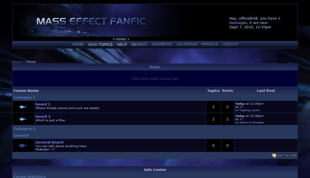 |
|
|
|
Post by Battlechantress on Sept 7, 2010 12:58:33 GMT 1
The text *might* need lightening up if it's not already in white. Otherwise, I'll just type out my initial response, which was: "Holy crap! That looks nice!"
|
|
|
|
Post by Clint Johnston on Sept 7, 2010 14:27:17 GMT 1
I like that a LOT better than the cerberus one.
|
|
|
|
Post by lieden on Sept 7, 2010 15:46:42 GMT 1
I got hooked with this one rather badly. I started making custom icons now! You can see its progress here, if you like. Changes so far (from the image above): seamless background, font priority changed to Trebuchet MS, made custom stars for rankings (-> Renegade stars! Yesh!) Next: fix the header area a bit, because I don't like the way the current forum location is displayed right under the logo; more custom icons. Also, on my home laptop the link colour sort of blends with the text colour. |
|
|
|
Post by Mr. Glow on Sept 7, 2010 16:15:01 GMT 1
It wasn't Nemonus' idea, it was MYYYYYYYYYYYYYYYYYYYYYYYYYYYYYYYYYYYYYYYYYYYYYY idea!!!!!!!1  Just kidding, I'm very impressed by this theme though, it looks very smooth and very Mass Effect! |
|
|
|
Post by lieden on Sept 7, 2010 16:41:31 GMT 1
Glow! Glow! I'm sorry, I got it wrong! :((((
Modifying previous post NAO! :}}}}}
|
|