|
|
Post by Mister Buch on Apr 27, 2012 11:14:36 GMT 1
Still looking good. I might say Shepard's eyebrows are a bit big, and that I think her hand is a bit off at the last page.
I love the design and the staging though - that one picture with Shep, Garrus and Wrex in ascending height is pretty awesome.
|
|
|
|
Post by Tillian Panthesis on Apr 27, 2012 14:36:39 GMT 1
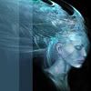
Fair enough with the hand. I suppose I should referance hand movements more often. As for the eyebrows... aren't the eyebrows tend to to be big on the side in-game.? 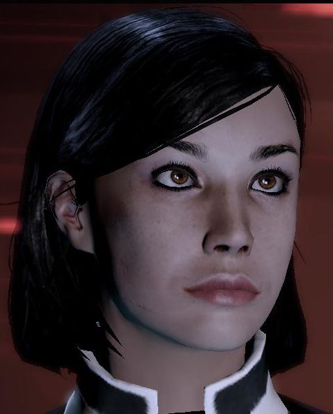 The Femshep in the comic was based on this woman here. Then again, my perception might be wrong here. |
|
|
|
Post by Mister Buch on Apr 29, 2012 0:08:17 GMT 1
I think the eyebrows on your most recent page are bigger and thicker than those, Till.
|
|
|
|
Post by Tillian Panthesis on Apr 29, 2012 8:33:26 GMT 1
Come to think of it. You're right. I'll rectify that next time. Still the eyebrows in-game are massive some of them.
Speaking of which, man I wish I can paint faster so I can work on Act 1. That's where the fun begins!
|
|
|
|
Post by lieden on May 1, 2012 9:32:46 GMT 1
Long overdue input on the visual style (I've just been swamped lately):
I feel it needs to be a little more consistent in regard to whether you go for a clean, digital style, or a more sketchy one. Across your pages, you have some very cleanly drawn elements (the planets, several horizontally-oriented backgrounds), while others are very sketchy (e.g. the Citadel from space). I think you can go for either, and perhaps even find a way to combine the two looks, but right now it looks a bit arbitrary.
|
|
|
|
Post by Tillian Panthesis on May 1, 2012 10:13:06 GMT 1
I prefer the sketch look, but some people like Buch might not like wiggly lines.
Well, I guess I can go both ways or try to make the sketch style more bearable, but that probably means in the future I might have to draw backgrounds by hand instead since I'm having issues drawing long lines in a consistant manner, since the disconnect between the tablet and the screen is still glaring for me.
So any tips on how to make myself more comfortable with the tablet in general? I could use some.
|
|
|
|
Post by lieden on May 1, 2012 10:59:15 GMT 1
Rough 'wiggly' lines can look great with traditional media (an example I love is Pitch Black, which I whole-heartedly recommend to everyone), but probably less so in digital unless you're going for a very stylised look in the first place. You can get very clean forms using the Pen tool in Photoshop, or by drawing most stuff in a vector graphics app (Illustrator, Inkscape) and then colouring them in PS or other software of choice. I'm not sure what advice to offer for the tablet. The eye-hand coordination improves over time (you might want to check your mapping settings to see if there's something that can be tweaked there). Zooming out of your picture sounds like a good idea if you have to apply a long stroke. Also, pressing shift between clicking at two points on your canvas can get you perfect straight lines. Hope these help! |
|
|
|
Post by Tillian Panthesis on May 1, 2012 16:11:33 GMT 1
Thanks, I'll try that. See if that helps.
|
|
|
|
Post by Mr. Glow on May 1, 2012 23:30:56 GMT 1
Rough 'wiggly' lines can look great with traditional media (an example I love is Pitch Black, which I whole-heartedly recommend to everyone), but probably less so in digital unless you're going for a very stylised look in the first place. Pitch Black is my favourite Vin Diesel movie too! |
|
|
|
Post by lieden on Jun 22, 2012 7:22:35 GMT 1
|
|
Aerecura
Commander
 Calliope Queen
Posts: 244
|
Post by Aerecura on Jun 22, 2012 19:30:22 GMT 1
Hey Tillian! Just wanted to drop by this thread and say that I really enjoy your comic. I normally don't read a whole lot of them (I prefer pure fiction for the most part, haha), but I love the way you draw your Shepard. Also, Wrex and Garrus' interactions in this last update were great!
|
|
|
|
Post by Mister Buch on Jun 22, 2012 23:47:33 GMT 1
That last page was drawn very well, too.
|
|
|
|
Post by Mr. Glow on Jun 23, 2012 1:56:58 GMT 1
Definitely keeping an eye on this. The art's good, and I'm really looking forward to seeing where things go once this flashback/prologue deal is over!
|
|
|
|
Post by Tillian Panthesis on Jun 23, 2012 13:14:33 GMT 1
Wow... I'm speechless about having my page posted on Reddit... and I'm flatted after seeing some of the comments they make. Especially about my Shepard, since I have no intentions about make her the Helen of Earth or something. Still it's nice to see many people enjoying the pages. And I did enjoy the discussion of comapring the competition between Wrex and Garrus with Legolas and Gimli that they had. And thanks guys, I'll continue to do my best in the art department and keeping a close eye on the story arc.  |
|
|
|
Post by Mister Buch on Jul 3, 2012 6:52:04 GMT 1
The latest page looks very good. I like the transition, and the way the character has physically changed is effective. I think it was a good idea to have that distinctive scar on her, because its removal now gives a strong sense of the 'missing two years'.
And the placing of that Cerberus logo behind the two panels is inspired.
|
|